Concept: Rethinking calendar access in Craft
Problem
Craft is a note-taking app known for its clean interface and flexible scheduling tools—like Daily Notes, a feature designed to support planning and journaling day by day. Unfortunately, despite its importance, many people didn’t realize it existed or struggled to find it:
“Daily Notes is what exactly? I see no tab anywhere that says Daily Notes... I literally went in to make a note... hunted a bit for a button... couldn’t find [it]... by the time I gave up I forgot the note I intended to write.”
(Reddit)
Solution
A new user journey blueprint was the backbone of the solution. It was founded on the underlying cognitive dialog. As a result it became more intuitive, but also streamlined, and—unlike before—accessible from each major destination within the app. Finally, it didn’t collide with the outgoing solution, offering numerous chances to carry out an unhurried adoption.
Ergonomics
In the early stage I heavily committed to ergonomics, and attempted to arrange all journey related controls within a steady grip thumb reach.
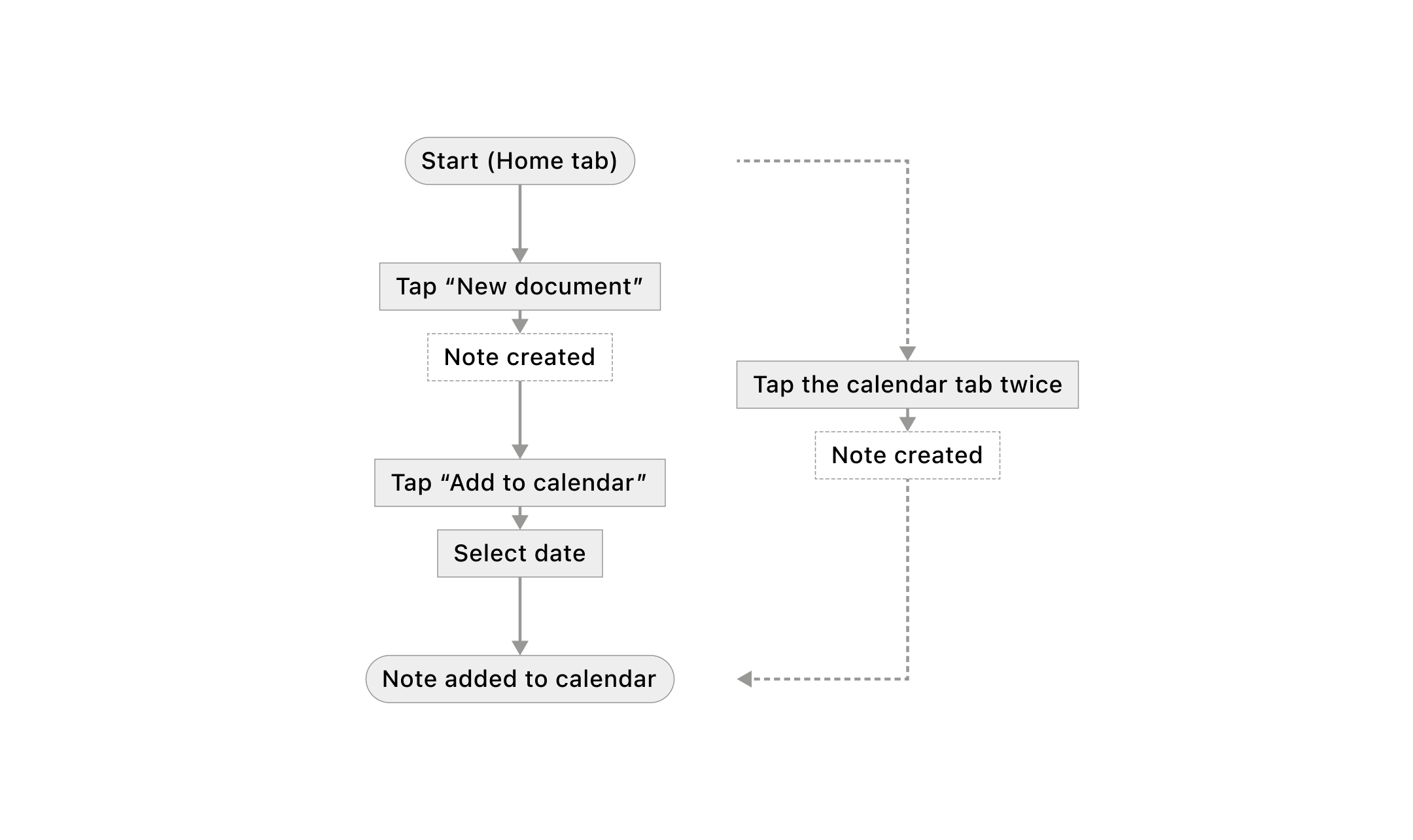
Floating button concept
1
The button floating above the keyboard is easily accessible, even without adjusting the grip on the device.
2
There is significantly less content stress near the right edge of the view. The content is left-aligned and rarely clashes with a floating and compact "Add date" button.
Unfortunately, it emerged as more complex than expected. The app’s editing GUI was well established and densely arranged. Interrupting this long solidified harmony called for evidence-backed reliability.
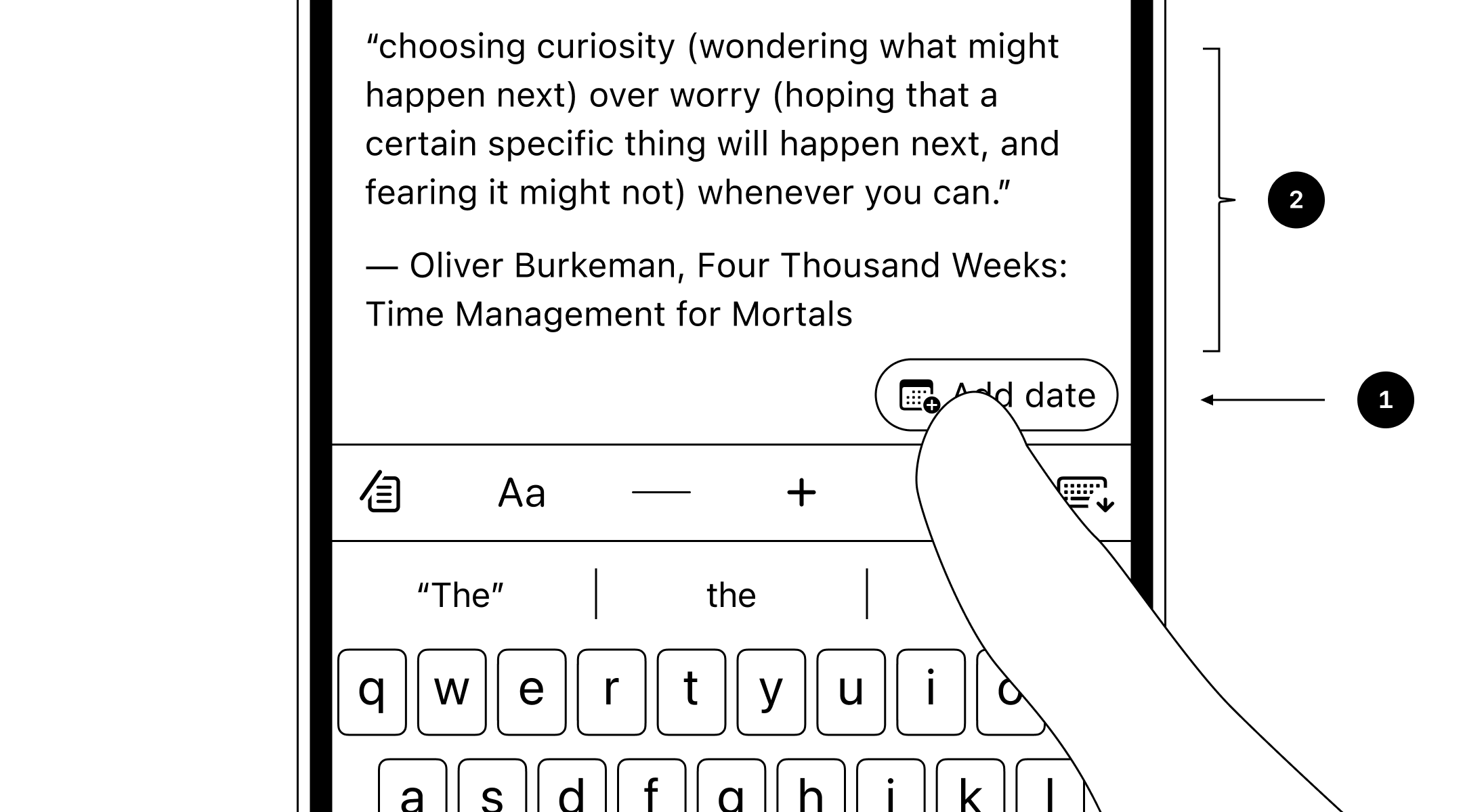
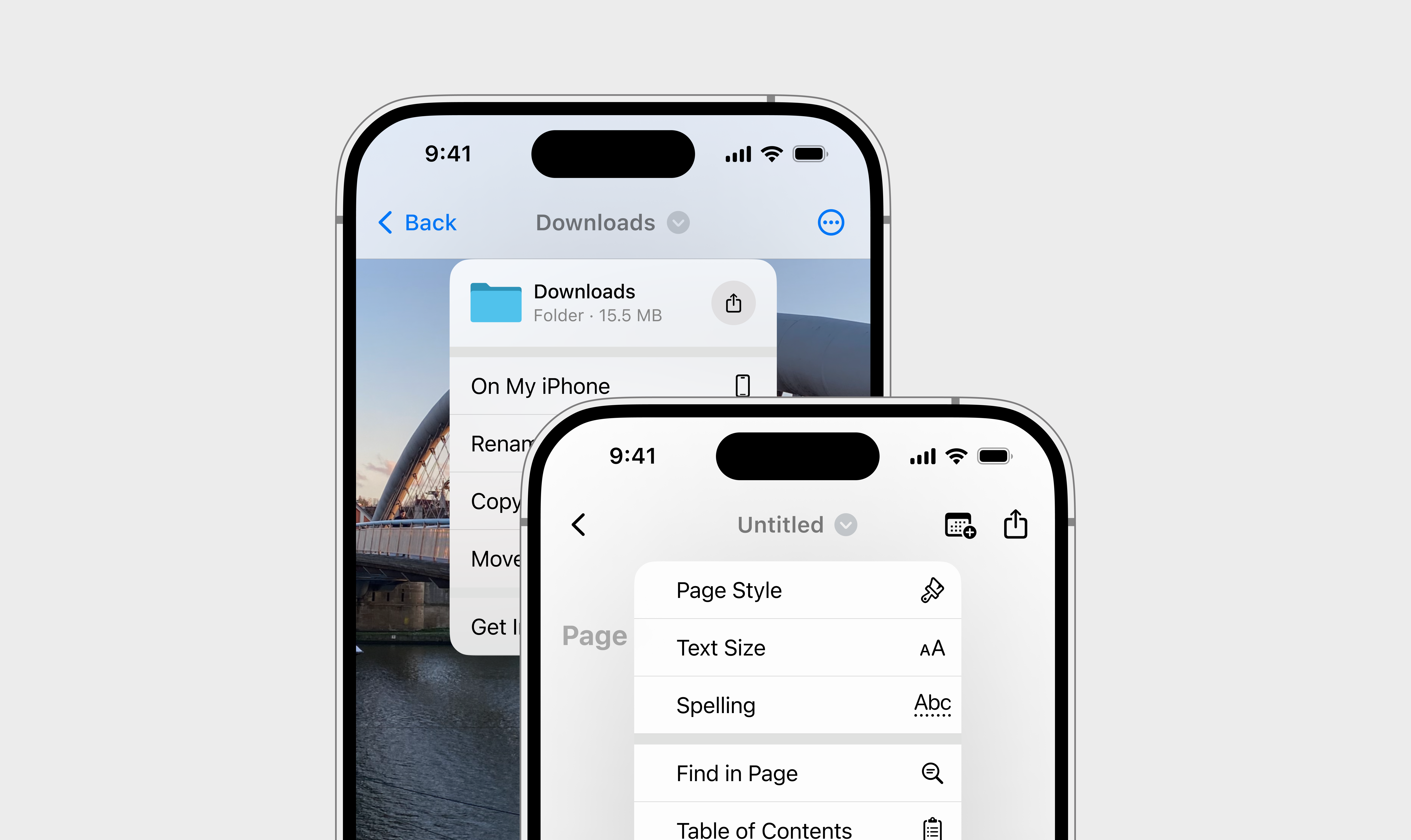
Toolbar concept

1
The menu offers a deliberately simple set of options before revealing the calendar - a view that is more demanding in the cognitive context.
2
The icon "jumps" and rotates around its Y-axis while subtly changing its look to match the new identity. The transition choreography is zippy, and free of text.
Reliability & performance
Origami Studio enabled me to quickly and precisely prototype the extended range of early-stage concepts.

Each prototype was equipped with a new soft keyboard I developed specifically for Craft. It offered better-optimized performance compared to the standard iOS keyboard and the Origami text field stack. It supported both portrait and landscape orientations, and light and dark modes, across all iPhone devices.
Despite ergonomic superiority earlier described solutions underperformed. I reckon the calendar buttons were overshadowed by the dense layout of text-formatting controls. The mismatched action and running frequency contexts didn’t help either.
Discoverability
I found out that rearranging the navigation bar and moving the calendar button inside it was a great way to put the button in the spotlight. It did leave a chilly footprint on ergonomics, but ultimately, the functionality remained outstanding. It also helped to establish a clear reference to formatting a file rather than its content. Overall, this new solution felt both promising and sustainable.
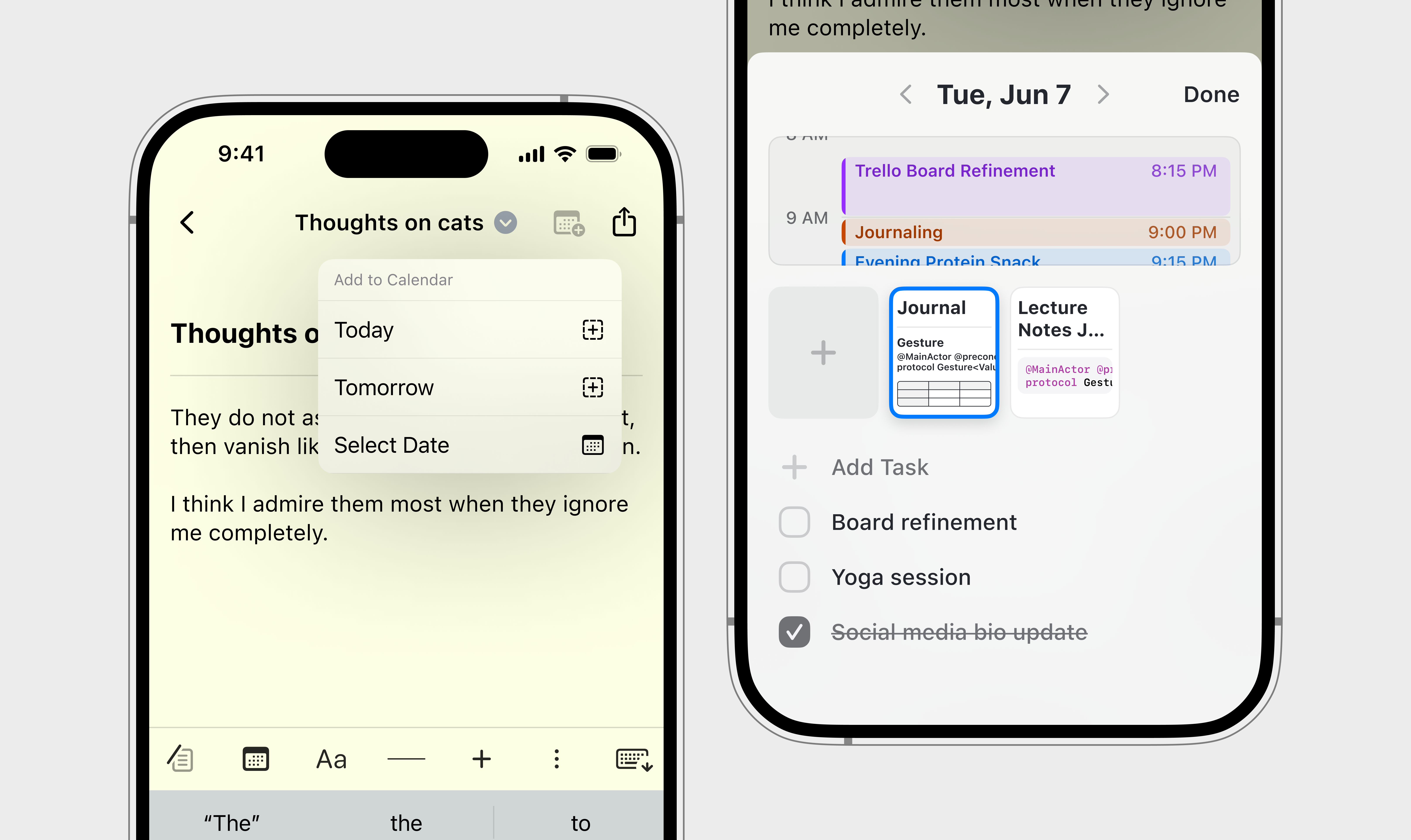
Once I felt confident about the solution, I engineered a SwiftUI prototype. It empowered me to test the solution once more in a highly authentic environment, verify development platform constraints, and engineer SDK-limited aspects of the design—like a bespoke light pan gesture.
Outcome: a 63% surplus
I invited 11 people to test the new design. As a result, 63% of participants completed the task of creating a calendar note using the newly introduced interaction path. To gain a more comprehensive understanding of the result, I calculated the confidence interval (at the 95% confidence level).
\[ CI = \hat{p} \pm z \cdot \sqrt{ \dfrac{ \hat{p}(1 - \hat{p}) }{n} } \]
Projected share of daily notes created using the newly introduced path: 35.2% - 92.0% (with 95% confidence)
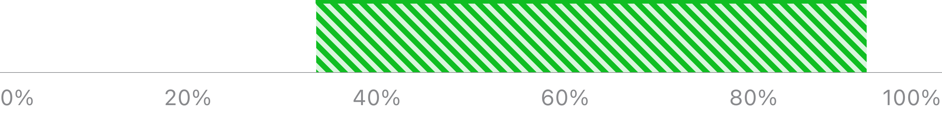
While the lower-end 35.2% might not seem substantial, it’s important to stress that any non-zero result is a success in this context—given that the original interaction path remains available, and the calendar notes feature is being promoted in the in-doc navigation bar.